This poster was born from a pure experimental moment simple, minimal, but very deliberate.
I worked entirely in Illustrator, just playing with form, type, and space. The background is a soft cream tone warm and neutral, acting like a quiet canvas for what happens at the center.
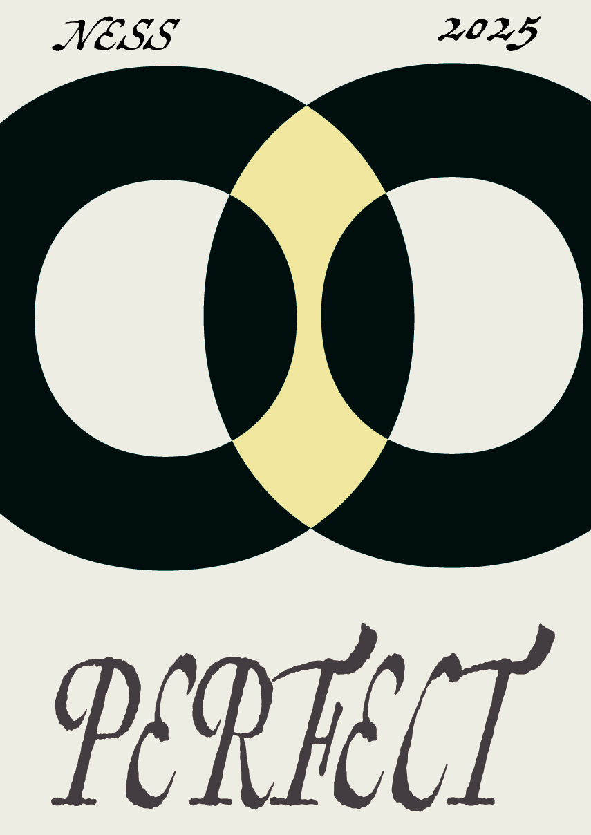
In the middle, I placed two uppercase "O"s from a sans serif typeface, overlapping them so their forms almost melt into each other. The space where they intersect turns light yellow, glowing slightly like a visual echo or something half-there. It’s abstract, kind of surreal, and meant to feel both balanced and slightly off.
Below them, I placed the word “Perfect”, written large, using expressive serif typeface. The lettering is elegant, slightly calligraphic almost like a whisper with weight.
At the top of the poster, it simply says “Ness” and “2025” a quiet timestamp. Nothing loud. Just presence.
Even though it's minimal, it follows a grid and respects spacing. The simplicity makes every detail matter more. It’s not about complexity it’s about tension, shape, and how tiny choices shift the meaning of a whole image.
This one feels like a mood. Like a design poem made out of air and shape.
*Everyone might see it differently and that’s exactly what makes it unique.