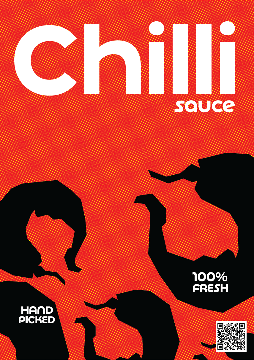
This project began as a hand drawn chili pepper illustration from my sketchbook.
I took that raw drawing and pushed it into a poster and made it more like an illustration simple, turning the peppers pure black, and placing them on a pixelated red-to-yellow background. It’s all about contrast, movement, and that spicy feeling.
Some of the peppers escape the bleed intentionally they’re not meant to stay inside the lines.
Scattered around the layout are playful elements like “100% fresh” and “handpicked,” hinting at food label aesthetics but keeping it graphic, not literal. There’s even a fake scan code, just to lean into the packaging world.
At the top, a soft, rounded typeface spells out CHILLI, while right below it sits the quiet tag:
sauce.
sauce.
This is a love letter to heat, texture, and that messy but beautiful blend of food and graphic design.
A poster that could live as a product label, a zine cover, or just something bold on your wall.
Chilli, spelled with two Ls, gives off brand energy.
It looks designed sharp, deliberate yet it still refers to the chili we all know: spicy, striking, and full of attitude.